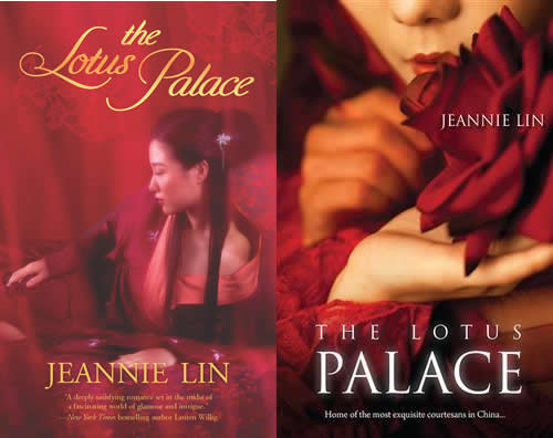
Tell you a secret: When I first saw the cover of my debut book, Butterfly Swords, I was kind of concerned. First of all, it didn’t look like anything else out there in historical romance. Second of all, I didn’t know if it was dramatic enough. It didn’t look action-y. It didn’t look romance-y. The hanfu, though red, was rather plain looking to me in the historical romance field where pretty dresses reigned supreme. It certainly was very bold-looking, but there were so many examples in Hong Kong cinema that to me looked so much more romantic and dashing than my girl in red.
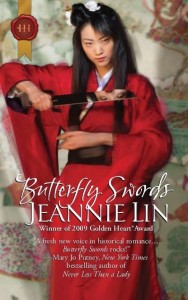
I was wrong to complain even just a little. Everyone LOVED that cover. It really stood out.
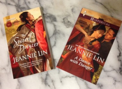
But when I got my first glimpse of The Sword Dancer, I was completely blown away. The Harlequin art department had come MILES from Butterfly Swords. Then when I saw the cover for the sequel, A Dance with Danger, I couldn’t stop grinning. It looked exactly like a still from a Hong Kong, Crouching Tiger style action movie. I had to put them side by side for comparison.
So here’s my cover commentary for A Dance with Danger:
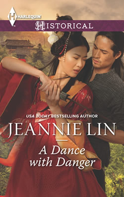
- First of all, in a world of clinch covers and heated embraces, this cover shows the hero and heroine mid-sparring duel!!!! You know I love the flirtatious sword fight. Awesome scene. (Note: In the book, my heroine actually never touches a sword though she does spar with a staff. Whatever. The sword looks cool. Points for the sword.)
- I do love the detail on the dress and the colors and the flowiness of it. My Little Sis was tickled that they even had the pom-poms in her hair. That’s not necessarily authentic to Tang Dynasty, BUT it’s very popular in HK depictions of imperial Chinese dress.
- I like that this one has the hero in it. And that he’s wearing a shirt. Tee hee. And he’s scruffy looking, in a good way.
- In my mind, Bao Yang, the hero of the book, is clean-cut and suave in appearance. The hero depicted here looks closer to what I imagined the outlaw Liu Yuan would look like. But that hardly matters. He’s attractive and it’s good to see an Asian male model getting work in Romancelandia.
- Why are they both closing their eyes? Would have been nice if there was a shot of them looking at one another.
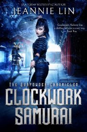
All in all, wow have my covers evolved since Butterfly Swords! It still looks like nothing else out there in romance or fantasy, and I have no idea if that will be a turn-on or turn-off for readers, but it certainly looks like a Jeannie Lin cover doesn’t it?
What do you think? Oh yeah, and I have a bunch of advance copies. Reviewers don’t seem to go for those much anymore. So I’ll be randomly drawing names from the comments to win advance copies. Let me know if you’d like to be entered and I’ll contact you via e-mail. If you are outside of the US or Canada, you may need to wait for release day and I’ll send via BookDepository.