


It’s always fun to see foreign editions. Given that my covers are unique and don’t have a bunch of period appropriate pictures in the Harlequin database, the foreign covers often re-use the art from the US edition, but in the cases where they differ, it’s interesting to see how the stories are marketed to an international audience.
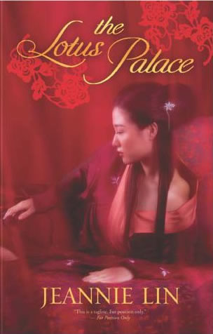
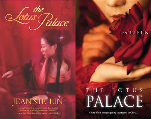
First, perhaps my favorite because of the resemblance to Amy Tan’s latest, The Valley of Amazement, here’s the Australian cover of The Lotus Palace side by side with the US cover. The US is on the left, Australian on the right.
I also just caught a glimpse of the French cover for Butterfly Swords, re-titled as La Fille de l’Empereur (The Emperor’s Daughter)
 |
 |
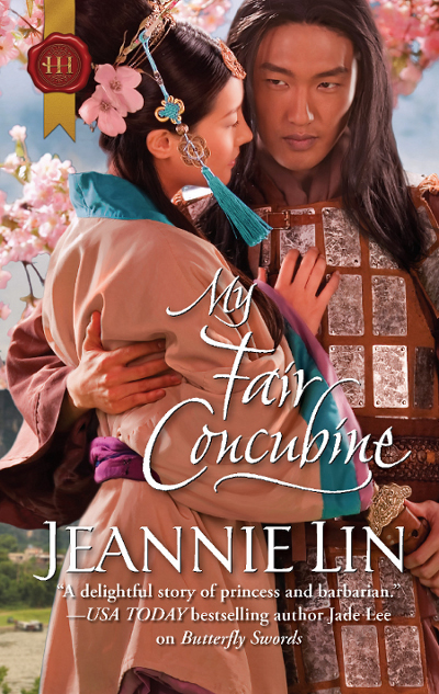
The French seem to prefer a more mysterious look without a full view of the face. The cover for My Fair Concubine (aka Princesse Imperiale) had a very literary and exotic look. Despite the inaccurate clothing for the period, I thought it very appealing.
 |
 |
What do you think? Which covers do you prefer?

Feb 10, 2014 @ 08:18:37
I prefer the original covers. Like you said, better historical accuracy. Also, swords.
Feb 10, 2014 @ 09:09:29
Hard to beat swords!!
Feb 10, 2014 @ 09:12:53
I prefer the originals, but if I saw the foreign editions, I’d still pick them up! They’re very mysterious and appealing in their own way.
Feb 10, 2014 @ 10:24:51
It’s also interesting that the US art for The Dragon and the Pearl was used for the Italian version of Butterfly Swords. The French cover for Butterfly (La Fille…) is also evocative of Dragon’s model. I think the overseas crowd may look for more romanticism and less realism in their covers?